Table of Contents
'I would like to wear that purple every day, but finding it in the shop is a feat'.
This sentence was written on the social site Reddit within a popular debate on armouring, and it is not an isolated lament. A wave of consumers willing to pay for armourcolour consultations (+320 % of Google searches) are not finding the colours that enhance them in shops, because most brands continue to offer standardised palettes dictated by trend forecasting and classic seasonal cycles. It is as if we are still selling one-size-fits-all jeans in an era when everyone wants the custom fit.
Let us ask a simple questionIf thousands of people spend between 150€ and 300€ for a colour consultation, why do they then have to make do with colours that do not enhance their investment?
I am Corrado Manenti and, with over ten years of experience in developing emerging brands, I have observed that integrating theArmour in product strategy is not just an aesthetic trend, but a strategic business leverage. For brands that really want to stand out in a crowded market, it represents a revolution capable of generating three tangible benefits:
- Increased sell-through (the 'right' garments for each person sell faster)
- Drastic reduction of returns (the customer finally finds 'his colour')
- Organic loyalty based on the gratitude (yes, gratitude!) of those who finally feel seen and understood
Think of the power of a customer who says: 'This is the only brand that ALWAYS has my deep winter purple. I don't even have to try it, I already know it will be perfect". This is not just customer-centric storytelling, but the key to surviving garment saturation "one-season-fit-all“.
Are you ready to discover how to turn the science of armouring into sustainable profit? Read on to gain an awareness that will set you apart in the marketplace!
What is Armocromy
Before diving into business applications, let's do a quick but essential review. Armochromy has become very popular in recent years thanks to its popularity on social media, but it is not just a last-minute fad: in the 1980s, colour analysis started to become known thanks to the book Colour Me Beautiful by Carole Jackson, presenting herself as a precise subject matter with rules and codes. To know them is to speak the same language as your customers.
The concept is based on the idea that certain colour palettes are more harmonious and consistent than others according to certain visual characteristics: warm or cold, intense or soft, light or dark. But what if this approach, born in the world of beauty, is applied to the fashion branding? What happens is that suddenly colour stops being decoration and becomes consistent visual identity.
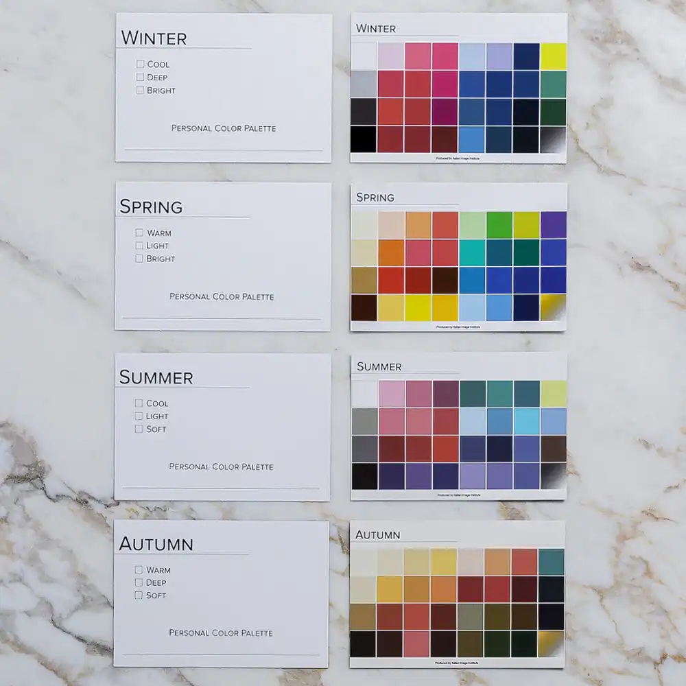
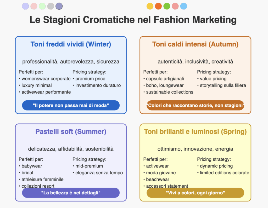
Anyone, in fact, owns a ideal colour palettefour 'seasons' (Spring, Summer, Autumn, Winter) designed to best enhance complexion, eye and hair colour. Known in Anglo-Saxon countries as Colour Analysis and in Italy under the evocative term of Armocromia, is based on theanalysis of warm or cold nuances and degree of saturation for select the shades that best enhance our natural colours.
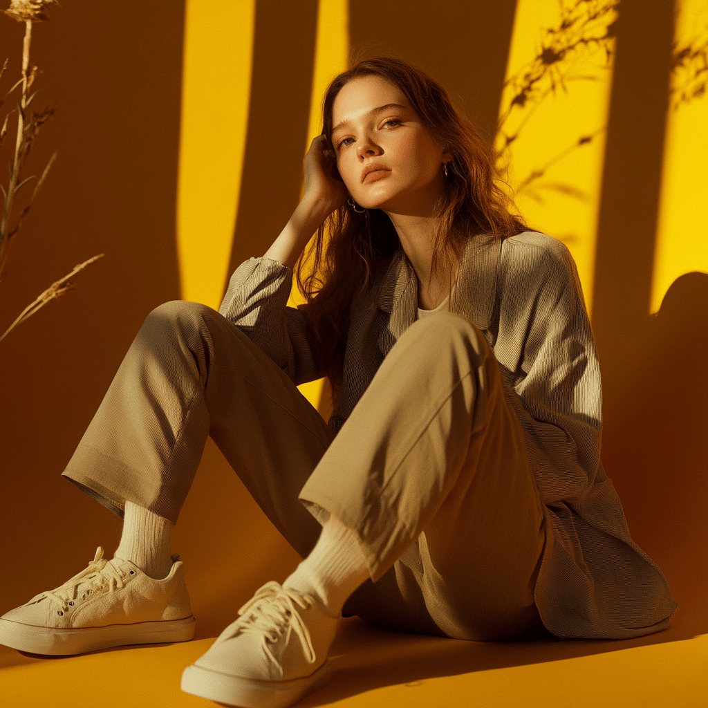
As Rossella Migliaccio explains in her book Armachromia - The friendly colour method that revolutionises life and not just the imageThere are 'friendly colours', capable of restoring brightness, energy and well-being, and 'enemy colours', which tend instead to convey a dull, tired or even ageing appearance.
The aim of armouring is not only to indicate eye shadows or accessories to match, but finding an overall harmony between clothing, make-up and individual natural characteristics.
One of the main reasons for its success is the greater need for certainty in an increasingly information-saturated environment. Colour analysis offers clear and structured answers to otherwise subjective questions such as "what colour looks good on me?", turning them into practical and easily applicable pointers.
Although the method is based on a rigorous evaluation of colour characteristics, once one has identified one's season it becomes really easy to create coherent outfits, leaving behind the monotony of 'I don't know what to wear' or the full reliance on black.
Is there such a thing as colour theory? A short guide to understanding it
When it comes to fashion, image and design, the terms Armour e colour theory often appear together. At first sight, they both seem to talk about colours, but in reality they refer to two different approacheswhich complement each other but do not coincide.
L'Armour is a discipline that analyses individual physical characteristics - such as skin undertones, eye and hair colour - to identify which colours enhance a person most.
La colour theory, on the other hand, is a more technical and universal subject. It is based on scientific and psychological principles that explain how colours interact with each other, how they are perceived by our brain, and how they arouse certain emotions. The main tools, such as the colour wheel, help to build balanced, contrasting or complementary combinations that are useful in the creation of fashion collections, visual graphics or interior environments.
La substantial difference is that the armoury is customised and person-oriented, while colour theory is general and applied to colour composition in a broad sense, such as a collection or a visual interface.
One works on the person, the other on visual construction: Armour and colour theory are two different but complementary tools.
Using them together allows you to create a collection or personal brand that works both aesthetically and emotionally.
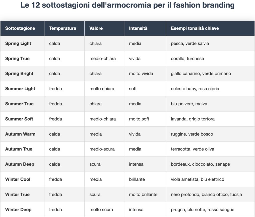
This is where the system becomes really powerful for a brand. Each main season is divided into three variants, creating twelve 'micro-palettes' combining temperature (warm/cold), value (light/dark) and intensity (soft/vivid).
This scheme might seem complicated to you, but it is exactly therein lies the opportunity. Most brands still reason by 'colours of the season', while customers look for 'the colours of MY season'. Subtle difference, huge commercial impact.
Emotional selling: how colours influence price, perception and loyalty
Now that we've cleared up the theory, let's see why armour is a goldmine for fashion marketing. And I'm not talking about hunches, but concrete numbers.
Here is the fact that should make you jump out of your chair: neuromarketing studies conducted by the Colour Association of America show that a product presented in the 'right' colour for the buyer's undertone is perceived on average as the 37% most valuable and justifies a price markup of up to +20%.
Let us translate: the exact same cashmere jumper, in the perfect colour for the customer, can be sold for 240€ instead of 200€. With the exact same production cost structure.
But there is more. An experiment conducted by Zalando in 2022 showed that:
- Customers buying in 'their' colours have a 23% lower return rate
- Increase by 41% the probability of making a second purchase within 60 days
- They spend on average 17% more per garment than customers who only buy following trends
The colour familiarity bias
There is another psychological phenomenon that works in your favour: 'colour familiarity'. People tend to trust and unconsciously prefer brands that use consistent palettes with their natural colours.
Try this experiment: show a Winter woman the Instagram feed of two brands - one with Winter palettes and one with Autumn palettes. Without telling her anything about the colour scheme, she will tell you that the first brand "seems more reliable" and "more quality" to her. It's not magic, it's perceptual psychology!
Integrating the''armour branding" means therefore using colour as a double driver: aesthetic (it enhances me) and value (it communicates who I am). Your customer no longer buys 'a blue jumper', but 'MY blue, the one that makes me feel powerful in the office'.
Why do brands (still) ignore colour analysis?
If armour is so powerful, why aren't all brands already implementing it? Simple: because the fashion industry loves to convince itself of things that are not true. Let's dispel these myths one by one.
Myth 1: 'Too many SKUs = unmanageable stock'
OK, I get it. The idea of producing each garment in 12 colour variants gives any logistics manager hives. But is it really necessary?
The truth: production models have evolved enormously. Thanks to technologies such as:
- Garment dye on small batches (MOQ up to 30 pieces)
- On-demand digital dry cleaners (e.g. Tintex in Portugal)
- Shared dye rooms between brands (co-operative model)
- Digital printing on prepared fabrics (PFD)
Today, it is possible to produce coloured mini-batches with a reduced initial investment of 60% compared to just five years ago. And the fact that brands such as Pangaia or Colorful Standard are growing in double figures with models based on coloured micro-productions should give you pause for thought.
Myth 2: 'The consumer doesn't care'
This is the biggest selfie in fashion retail. Just take a trip on TikTok with the hashtag #coloranalysis (3.8 billion views!) to understand how obsessed consumers are with finding 'their colours'.
A recent survey by The Body Shop revealed that 78% of women have bought at least one garment that they then rarely wear 'because the colour doesn't suit me'. This represents an estimated EUR 5.2 billion wastage per year in Europe alone.
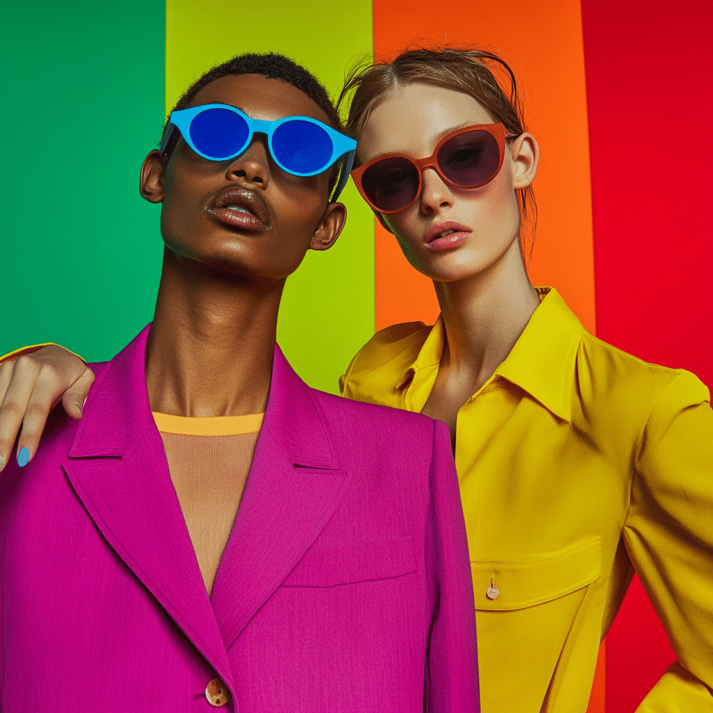
The Reddit thread mentioned in the introduction clearly shows that niches such as Winter Vivid or Spring Bright are willing to pay premium prices to find their perfect shade. This latent demand explains the success of brands such as Kettlewell Colours, which went from start-up to 15 million turnover in 7 years with a 100% palette-based model.
Myth 4: 'It's too complicated to explain'
"Customers won't understand all this colour theory" - really? Yet they perfectly understand concepts like 'Korean skincare in 10 steps' or 'macronutrients and calorie deficit'.
The truth is that consumers in recent years are increasingly willing to acquire technical knowledge when it can improve their experience. And theArmour has a huge advantage: the results are immediately visible. Showing a before/after is enough to convert even the most sceptical of customers.
The mistake is to believe that everyone must become an expert. Your job as a brand is not to teach armoury, but to apply it in such a way that the customer can benefit from it even without knowing the theory.
From analysis to palette: how to translate colour into a collection with BAD
In our style office, thecolour analysis starts with a strategic brief: brand identity, mood to be communicated, competitive context. From there, we work on the ideal colour map, considering:
- visual tone of the market,
- characteristics of the target audience,
- psychology of colours,
- and consistency with materials and fabrics.
It is a job deep and technicalbut which produces results that are visually simple, elegant, and functional. At a time when every brand is fighting for a few moments of attention, visual consistency becomes strategy.
And here, theArmour is no longer an aesthetic exercise, but a real operational tool for those who want to (re)make sense of their creative wardrobe. If you already have an existing collectionstructured but confusing, broad but visually uneven, armoury helps you to reorganising visual material without starting from scratch.
It is like taking a cluttered bookcase and putting the volumes back in place not by cover colour - but by sense. L'chromatic identitywhen correctly identified, is what holds every choice together: from the first sketch to the launch campaign.
Step by step: progressive implementation
Implement theArmour within a brand is not a radical intervention, but astrategic evolution. There is no need to revolutionise everything from one day to the next. On the contrary: often it is precisely the adoption gradual and conscious which leads to the best results.
A progressive approach allows the team to assimilate the language of colour, test audience reactions, gather feedback and adapt creative direction with agility.
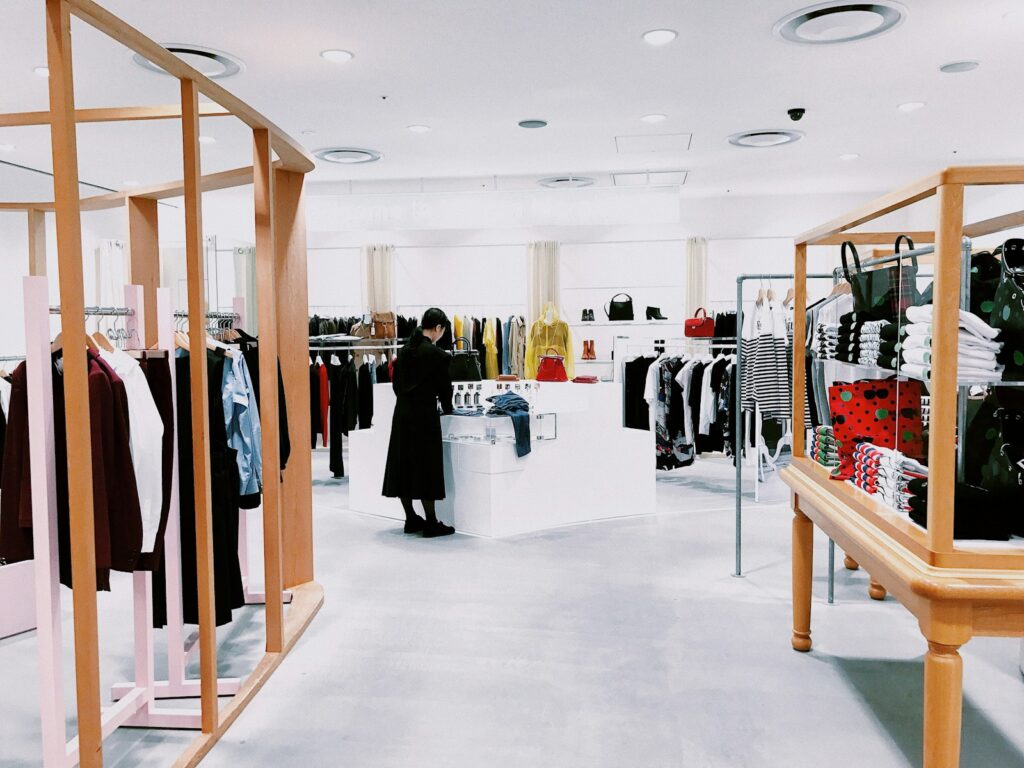
- The first step? The chromatic analysis of current identity.
This is not just about logos and graphics: photographs, packaging, Instagram feeds, lookbooks, shop windows, signage and POP materials are also investigated. All these elements combine to generate the overall visual perception of the brand. It is a phase that often surprises the customer, because it reveals dissonances invisible to the naked eye, but very clear in the overall visual reading.
- Second step: the mapping of existing products according to the four seasons.
Here we begin to build a new logical organisation of the collection, grouping garments, accessories or visual elements into colour families. This makes it possible not only to identify imbalances or overlapsbut also narrative opportunities that were previously latent. For example, you may find that your catalogue is already strongly oriented towards a 'Summer Soft' palette and that you only need to enhance it to make it coherent - without developing new articles.
- Third step: starting with digital.
Why? Because it is the most flexible, updatable, measurable channel. We start by reviewing the website palette, the tone of the visuals, the consistency between social content and collection mood. Here the benefit is immediate: more consistency = more visual authority = greater perceived trust. And trust, we know, sells.
💬 The progressive implementation of armouring is an organic process, accompanying the brand in its visual evolutionrather than forcing it in a foreign direction. Every small intervention generates immediate effects: clarity, recognisability, memorability.
The result? A collection that 'speaks' without too many wordsa visual identity capable of sticking. In a landscape where everything looks the same, you will be recognisable at a glance.
Line, capsule and occasion pallets
Armour can also guide the design of lines modularcapable of adapting to multiple scenarios. You can build:
female, male or genderless lineseach with its own chromatic voice but traceable to its mother identity;
capsules linked to occasions of use (e.g. ceremony, holiday, work) with colours consistent with the emotion associated with that moment;
seasonal palettes for eventsthink of a holiday collection based on 'Deep Winter', or a spring limited edition with 'Bright Spring'.
In our work with BAD, we often build colour moodboards fictional guiding not only design, but also styling, lookbook, merchandising and digital.
And do you know what the most interesting side effect is? That the customer, finding harmony between garment and accessoriesnaturally tends to complete the look. This facilitates upselling and makes the shopping experience more polished and smooth. You're not just selling a garment: you are selling a coherent vision.
Creating a brand from scratch based on armour
When you create a brand from scratch, every choice communicates. The colour you use to open the website, the shade of the paper in the packaging, the background of the Instagram feed: everything contributes to forming a first visual impression. And do you know how long it takes the brain to form it? 13 milliseconds. You don't have time to explain: colour speaks for itself.
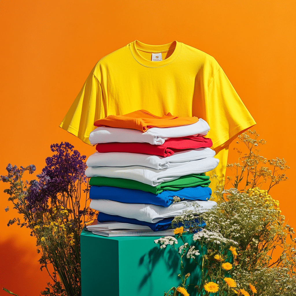
That is why if your dream is to open your own personal brand, integrate theArmour from the initial stages of brand creation is one of the smartest moves you can make. It allows you to define a strategic colour identityable to distinguish yourself in an immediate, coherent and authentic way.
The approach we propose in our BAD style office does not start from 'choosing a colour you like', but from a guided processAnalysis of the concept, the visual target, the desired positioning. We build a customised colour mapbased on a reference armorial season, with variations for gamma, saturation and contrasts. The result is a clear visual voicerecognisable, replicable on any medium.
A armoured palette well studied has the power to:
make the brand memorable;
facilitate cross-channel coherence (online, offline, social, print);
create instant empathy with the right target group.
When every touch point communicates the same colour sensation, the perception of quality, reliability and professionalism increases exponentially.
Naming, logo and storytelling based on guiding colours
But armoury does not stop at the palette. Influence also the language, the tone, the naming. Yes, because each colour has a sound, a rhythm, a personality. A brand that speaks in 'Deep Autumn' tones, for example, will use words that are warm, evocative, dense. A 'Cold Winter' brand will be more direct, essential, edgy. La coherence between visual and verbal language is what turns a brand into an experience.
In our process, the aim will be to develop naming and payoffs from the colour coding. We use the armoured season as semantic matrix: guide colours → emotions → keywords → naming.
📌 The truth is many brands are born weak because they lack a structured visual language. They use colours because they are 'in fashion', they change their look every season, they confuse rather than communicate. Armoury offers you a stable narrative basisbut at the same time flexible: you can evolve, grow, add layers. But you do with a solid visual frameworklike a house built on secure foundations.
Inspirational case studies and brands
Let's move on to concrete cases: who is already making money with armouring?
Kettlewell Colours - the pure armoured DTC
This UK brand founded in 2004 has built an empire on a simple concept: quality basics in every possible shade of achromic.
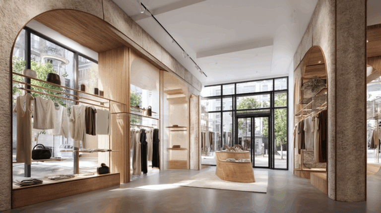
Key Numbers:
- 300+ shades mapped over 12 seasons
- 40% growth YoY over the last 5 years
- Reduced bounce rate of 25% thanks to 'search by season' filters
- Customer lifetime value 2.8× higher than industry average
Winning strategy:
- Monthly micro-stock drops to test new nuances
- Exclusive partnership with House of Colour (UK consultants network)
- Live shopping with certified consultants every week
- User-generated before/after gallery with thousands of contributions
White House | Black Market - dominant winter
A shining example of a brand that has made a radical choice: focus almost exclusively on Winter palettes.
Key Numbers:
- Limited palette (optical white, deep black, jewel tones)
- 27% retention rate vs. 18% industry average
- NPS higher than the 35% category average
Winning strategy:
- Absolute consistency in aesthetics (sharp contrasts, no half-tones)
- Power dressing' communication aligned with Winter values
- Easy mix-and-match between different collections
- Very precise target group: professional woman 35-55, predominantly Winter True/Deep
Less is more. Nothing could be truer for our case. Perfectly serving a chromatic niche leads to superior fidelity.
Colour fashion, an opportunity for a communication agency?
If armour is on everyone's lips today, let us remember that it is because it has found fertile ground in digital languages. From monochrome Instagram feeds to ultra-defined brand guidelines, colour has become the new code to decipher for those involved in visual communication and strategic copywriting.
For acommunication agencyriding the trend of theArmour means presenting oneself to the market with an extra gear. We are not just talking about 'offering a new service', but about positioning oneself authoritatively on a subject that has a organic research in vertical growth. In the last 12 months alone, Google searches related to armour in branding increased by 47% in Italy. We are facing a latent demandoften still not satisfied by truly competent players.
💡 Here is an operational insightMany websites today are 'clean', uncluttered, minimal. But how many communicate a visual identity that speaks to the target audience in an emotional way? Integrating an armorial system into the web designin the visuals of a blog or in sponsored content is the best way to increase site memorability, improve the dwell time and reduce the bounce rate.
For an agency, colour is not just an aesthetic code. It is positioning, strategy, visual storytelling.
User Experience and Personalised Shopping
But let's go beyond positioning: what happens when apply armour to user experience design?

In an e-commerce, UX is not just about buttons and loading times. It is made of visual emotions. Integrating the armorial principle into the UX allows you to guide the user through a tailor-made experiencealmost as if the site already knew it. And do you know what happens when a brand 'speaks your colour language'? You feel welcomed, understood. And you buy.
Imagine entering an online shop that offers you a personalised selection of garments based on your armour season. You are suggested clothes in tones that enhance your complexion, your style, your visual taste. Each page is consistent with your preferred colour perception. The result? Trust, involvement, conversion.
This is one of the next frontiers in online fashionemotional and visual shopping, hyper-personalised through colour segmentations. We are not just talking about demographic or behavioural data: we are talking about visual sensitivity.
FAQ
💬 What really is armouring applied to fashion?
L'Armourin fashion, it is not just a question of 'looking good' in certain colours. It is a strategic tool which allows brands, stylists, designers and creatives to build visually coherent collections designed to connect emotionally with the audience. It is not a passing fad, but a method of communicating identity through colour.
💬 Can I use armouring if I already have a collection ready?
Absolutely. One of the advantages of armouring is precisely the flexibilitycan also be applied to existing products. It helps you reorganise them, tell them better, create thematic capsules or targeted restyling. Often, a colour intervention can revitalising an entire collection without having to do it all over again.
💬 Is it also useful for male or unisex brands?
Of course. Armour is not gender-specific. The key is thecolour-sensitive approach: each visual identity can find in seasonal theory a way to speak more clearly and coherentlyregardless of the audience.
💬 But don't I risk limiting myself to 'just four colour groups'?
No, because every season has within it thousands of possible combinations. Armoury does not limit, it guides. And the job of a specialised style office is precisely to find the more suitable shades within each group, building unique, non-stereotypical palettes.
💬 Is it really a competitive advantage?
Yes. Today, the brands that sell the most are not those with the widest offer, but those with the clearest vision. Armoury gives you the tools to build a strong visual narrative that sets you apart in a market where everyone shouts, but few really communicate.
If you have read this far because, after all, you know that colour matters. You know that a brand is not only built with good ideas, but also with a solid, coherent, recognisable visual vision. You know that the public, today more than ever, chooses with the eyes before even with the head.
And this is where we can come in.
🎨 In our BAD style office, we offer a free consultation to help you:
define thecolour identity of your brand;
build a strategic palette for your collections;
design a visual language that talk to your audience (before you even say a word).
Whether you have an already active brand or are starting from scratch, we can accompany you on a path custom-madewhere harmonisation is not a constraint, but a creative lever to enhance who you are.
📩 Request your free consultation now
Write to us and tell us who you are. We will help you discover which colours really speak for you.
Because in branding, as in fashion, colour is the first word you say.

